

HB Edit - Edition 37
Sharing the things on my ebay watch list that I don't have the space or money for, but wish I did.

Perhaps the cheapest thing on HB Edit yet… (currently listed at £1.16!). Some high camp and top bargains, as well as a trip down memory lane looking at the WOW House in 2022 - specifically the room designed by Rita Konig for GP&J Baker, a project I ran and loved. Enjoy!

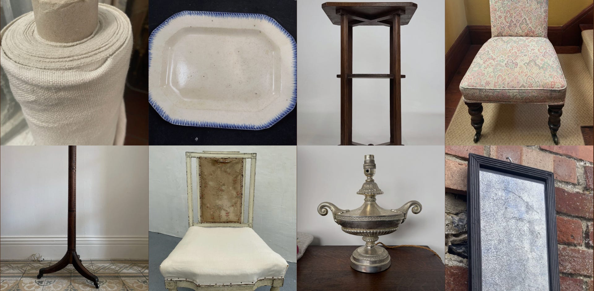
While this is labelled as a ‘project’ (aren’t we all?), I personally think it’s not far off! I really love the shabby-chic paint effect, and think the shape is very pretty. I can’t vouch for the condition of the seat-pad, but it’s a really lovely example of 19th century French furniture, which I am increasingly drawn to. Go forth and buy.

This is really rather expensive, but for a properly good Heals table, it’s not far off the mark of what they go for these days. I really like the design of the legs and feet, and think it’s a useful size. More in the camp of if I had the ‘money’ for this one…

One for our American pals (hello, and thank you for being here). This is such a pretty platter. Only today (well, yesterday by the time you’re reading this) was I in the V&A and admiring the ceramics, hypnotised by similar 19th century designs. Please someone buy this, and then invite me to stay (preferably you live in a John Derian-esque house, or are in fact John Derian himself).

I really, really like this. I think the design of the wood feels rather modern, while the patina and shape of the feet grounds it in a distinctively 19th century look and feel, which I love. Floor lamps are useful as they can be slipped in behind sofas or tables easily, and if you had any sense you’d snap this up. *With a Hum London shade, of course.

I am endlessly looking for a deal, and this is a good one if I’ve ever seen it. A lovely neutral linen, and plenty of it - you could do a whole armchair in this, which would like very clean and chic. And a steal of a price!

This is super high camp, and honestly could maybe look a bit Aladdin-y in real life, but I think it’s fun! (‘Fun’ said in a very Mum tone of voice). It’s kind of whimsical and with a cream card shade could even read 90s paired back high-glamour. Interiors shouldn’t be totally serious - this shows sense of humour. I like it a lot.

Small but perfectly formed. This is on the ‘foxed’ end of the mirror clarity spectrum, but I think the ebonised (/painted black?), reeded frame is really rather smart. Useful for a skinny piece of wall on a landing, or somewhere with less natural light, to add something reflective with more depth.

These high-backed side chairs were sometimes prayer chairs, used to kneel on in the Victorian times. If you’re the Godly sort, this could be fit for purpose, or otherwise it would make a lovely slipper chair in a sitting room, beside the fireplace. The taller back gives you an opportunity to properly see whatever fabric you re-cover it with, which is rather nice. And not a million pounds either!
Feature: for each edition, I will feature a person, object, room or place that inspires me.
This week, I am writing about the 2022 WOW House room designed by Rita Konig, which I worked very closely on.
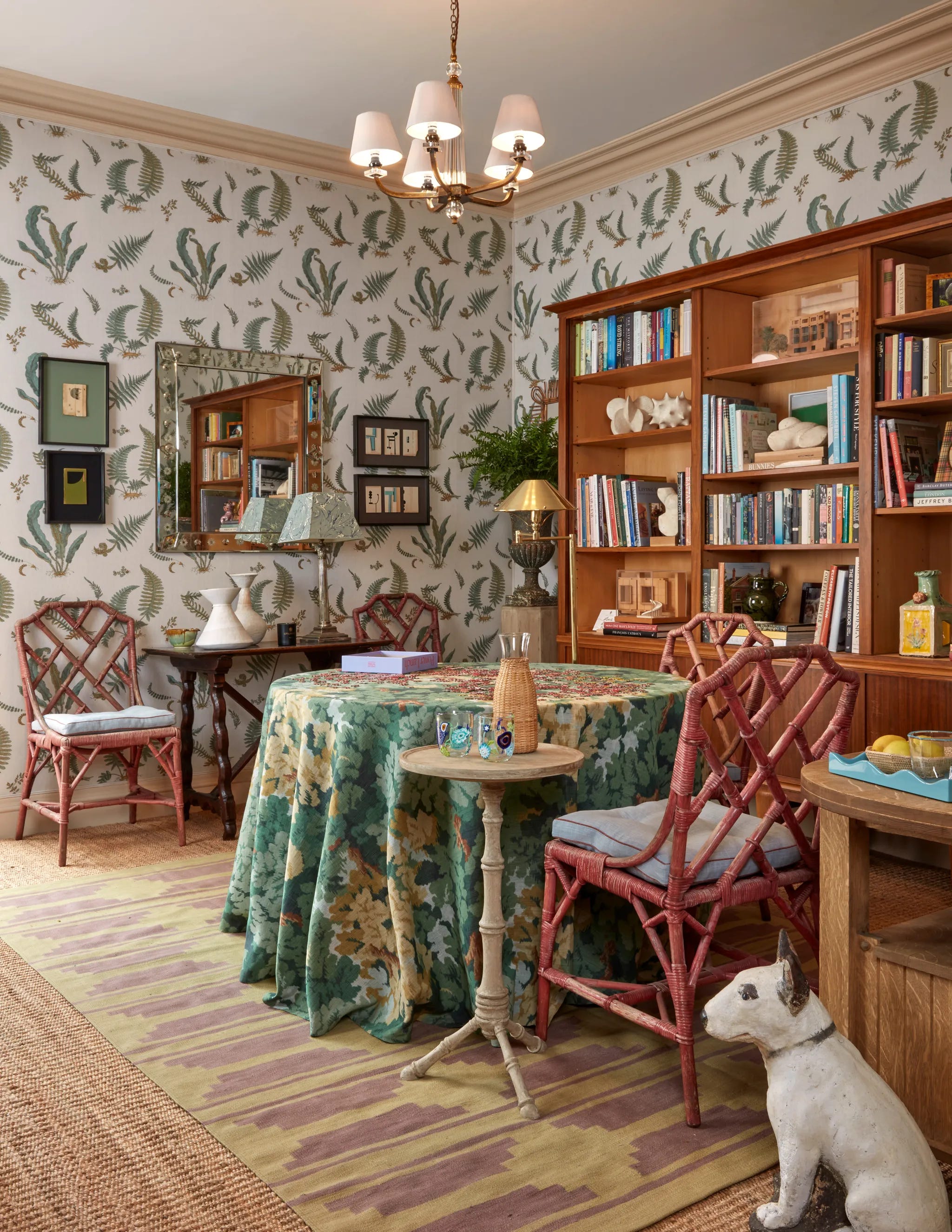
This room was in collaboration with GP&J Baker for the inaugural WOW House at Chelsea Harbour. If I’m totally honest, the jury was still out on the concept of this show-house. While similar projects are a huge success in America, garnering a lot of publicity and providing an opportunity for endless parties, there was a feeling that the English crowd wouldn’t take to it as easily. Perhaps because much of America feels like a film set anyway (sorry, but said with love!), it worked there? Whereas we are blessed with so much history in this country, in our buildings and interiors, and I was worried it would all read a bit flat and manufactured, and ultimate, a bit ‘show homey’.
How wrong I was.
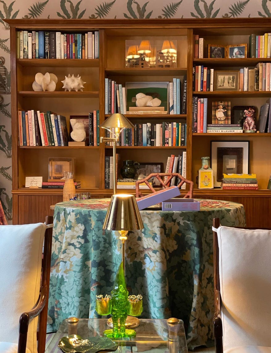
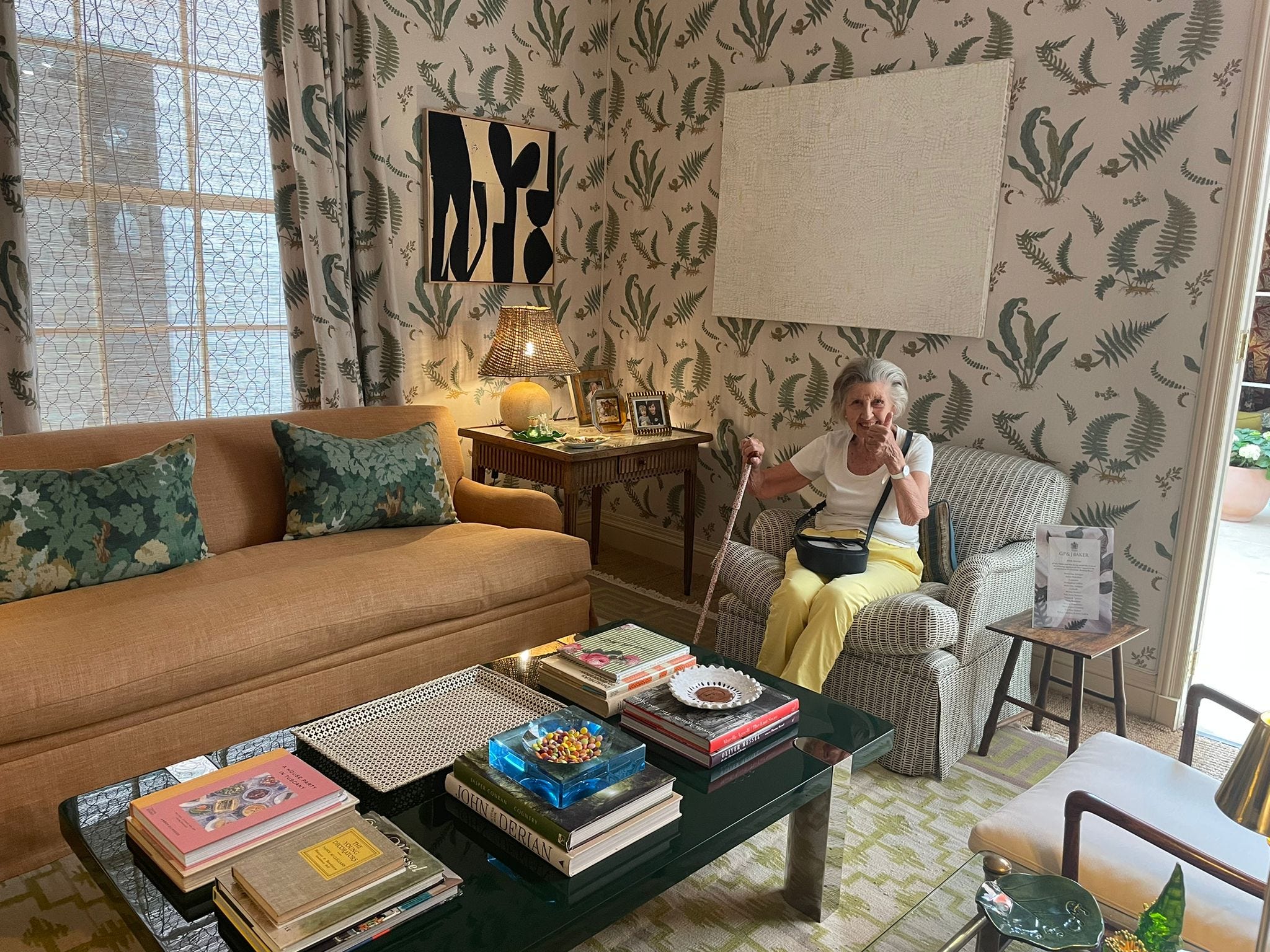
It was clear from the beginning that the team at GP&J Baker wanted this to be a huge success. They had put a very healthy budget behind it, and the team - led by Gavin Horton and Tom Murphy - worked properly hard. The basis of the room was the Baker’s Fern Chintz fabric, inspired by Elsie de Wolfe, which Rita was drawn to having seen and loved it in a room designed by her mother, Nina Campbell, in the 80s. We used it to cover the walls (yes in fabric, no expense spared) as well as on the curtains. It was paired with a wonderful tobacco linen for the sofa from the Bakers House Weathered Linen range, and a black-and-white match-stick fabric for the armchairs. The final piece of the puzzle was a fabric called Arles (now discontinued I believe?) used on a table cloth and some cushions, which brought it all together.
We enlisted the wonderful Chris and Ross from Johnston Cave Architects to design the architectural detailing - the french doors, the sash and panelled window and the cornicing throughout. Butter Wakefield helped plant up some actual ferns, and soon enough the room wasn’t flat at all, but alive and well.
For me, unsurprisingly, the stuff was really what made it. We borrowed from lots of generous dealers, including a mega bookcase and beautiful Spanish table from Brownrigg in Tetbury. We placed a set of 4 antique, red bamboo chairs around the puzzle table, from Maison Artefact on the Lillie Road. The coffee table was designed by Rita for The Lacquer Company, and the mid-century colonial chairs were from Hemisphere on the Pimlico Road.


But above all of this, the paintings and objects made it. These were all leant to us by the inimitable Rosanna Wilson Stephens at Wilson Stephens Jones on Westbourne Park Road. Rose had the best eye. I think I’ve only recently realised how much I was inspired by her. She helped shape art collections in two very special houses belonging to the closest of childhood friends, which have always been somewhat of a blueprint for my taste. She was ahead of so many of the curves we see today, finding Hugo Guinness and nurturing the likes of Ben McLaughlin, Peter Seal and Claudia Rankin. She carried it all with quick wit and charm, and - as far as I witnessed - could not stand bullshit. I certainly would not be brave enough to cross her.
She was so kind to me in those early years of my career, embracing me at the Battersea Decorative Fair like a long lost friend. I felt so special in her company. She advised on the first proper piece of art that I bought, and went into battle for me over the price. I had showed her a few others before this one, and she told me they were ‘boring’ which I thought was fantastic. When she said she liked something, you really believed her, and to have her seal of approval felt like the ultimate gold star. She is so greatly missed by anyone lucky enough to have met, known or worked with her.
It was a special project - a collaborative team effort across sectors - and the industry at its best. Happy, happy memories indeed.
More anon!

Instagram: @hugobeazley
Postal address: 97 Regency Street, London, SW1P 4AL
If I was on your side of the Atlantic, I would fight for that wood floor lamp. Sigh